For more than 30 years, Perfect Setting has been a trusted name in exceptional catering and heartfelt hospitality. Our story has always been rooted in care—care for our clients, our craft, and the moments we help bring to life.
Today, we’re thrilled to share a new chapter in that story.
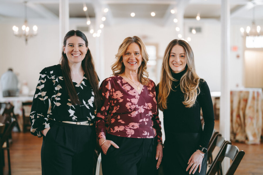
Under the leadership of Nicole Sigda—our longtime General Manager and now proud owner—we’ve refreshed our visual identity to better reflect the warmth, elegance, and personal connection at the heart of everything we do.
This update isn’t just about a new logo or color palette. It’s about honoring our legacy while embracing the future with clarity, intention, and creativity.
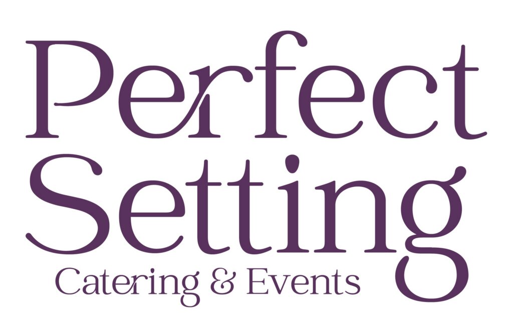
A Logo That Reflects Who We Are
Our new logo marries sophistication with approachability—representing the blend of refined culinary artistry and welcoming hospitality our clients know us for. With the updated “Perfect Setting Catering & Events” mark, we’ve created a modern visual that feels timeless and true to our brand’s enduring spirit.
The design feels clean and elevated, with balanced typography that works beautifully across digital and print—menus, signage, proposals, uniforms, and more.

Thoughtfully Chosen Fonts
Typography plays a powerful role in expressing personality, and our refreshed brand uses a combination of:
- OVO Regular – a classic serif font offering elegance, professionalism, and warmth
- Catchy Mager Regular – a softer, modern complement that brings a touch of creativity and approachability
Together, they create a visual rhythm that’s both polished and inviting—reflecting our curated, personalized approach to events.
A Rich, Refined Color Palette
Our updated color scheme centers around lush, versatile plum tones—deep, warm, and expressive—symbolizing celebration, richness, and human connection.
Our palette includes:
- Plum – Pantone 7648 C
- Red Plum – Pantone 19-2025 TCX
- Plum Perfect – Pantone 19-3316 TCX
These hues bring depth and sophistication to our digital presence and printed materials, helping our brand feel cohesive, elevated, and unmistakably ours.
A Refreshed Website to Match
With this new brand identity, we also updated our website to reflect our modern aesthetic and our values under Nicole’s leadership.
The site now offers:
A clean, intuitive design
Improved navigation for clients planning weddings, celebrations, and corporate events
Updated visuals that highlight our work, venues, and catering artistry
A more personal, story-driven experience rooted in hospitality
It’s more than a facelift—it’s a true reflection of who we are today and the memorable experiences we create.
Honoring the Past, Embracing the Future
As we unveil this refreshed look, we carry forward a legacy built over three decades—one defined by exceptional food, trusted partnerships, and meaningful connections.
Now, with Nicole Sigda at the helm, we’re deepening our commitment to personalization, creativity, and care. We’re investing in experiences that feel authentic, warm, and thoughtfully crafted.

Our new branding isn’t just a visual update—it’s a promise:
to continue showing up with heart, intention, and excellence for every event we touch.
Here’s to the next chapter.
Here’s to the moments we’ll create together.